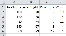
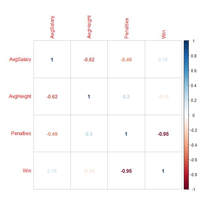
In my dummy sports data below, you can see that the number of penalties is correlated most strongly to wins.

But, if you had hundreds of variables, how could you generate the cross product of every correlation possible, in order to find the variables with the highest correlation? One answer: Use the Stats program called “R” to create a correlation matrix! You can generate all sorts of visual outputs, as well. Penalties sticks out like a sore thumb now:


Disclaimer: Without stating a hypothesis up front, these finding is nothing more than “data snooping bias” (ie: curve fitting) The discovered association might simply be natural random variation, which would need to be verified with an out of sample test to have any validity at all.
To do this for yourself, here are the steps:
- Download, install, and start R
- Download the sample data located here
(Right click -> Save as …into a folder you’ll remember!)
Enter the following commands in R:
(The lines with # are just comments, do not type them. Just paste the bold commands!
# Import data
> data1 <- read.csv(file.choose(), header=TRUE)
# Attach data to workspace
> attach(data1)
# Compute individual correlations
> cor(Penalties, Win)
# Scatterplot matrix all variables against each other
> pairs(data1)
# Generate a CORRELATION MATRIX !!
> cor(data1)
Here is how to generate the visual output:
> library()
…Scroll back up to the very first line of the popup window. Packages are probably in something like library ‘C:/Program Files/R/R-3.3.0/library’
Download and install “corrplot” Windows binaries package into the library path above.
Note: When you extract, you will see the folder heirarchy: corrplot_0.77/corrplot/….
Only copy the 2nd level folder “corrplot” into the library/ folder. (ie: Ignore the .077 top folder)
# import corrplot library
> library(“corrplot”)
# generate correlations matrix into M
# You now redirect the cor() function output we used above into a matrix called “M”
> M <- cor(data1)
# Plot the matrix using various methods
# Method can equal any of the following: circle, ellipse, number, color, pie
> corrplot(M, method = “circle”)
> corrplot(M, method = “ellipse”)
> corrplot(M, method = “number”)
> corrplot(M, method = “color”)
> corrplot(M, method = “pie”)