Off-topic tangents are a good thing for class

- For questions that asked students to simply remember facts, like dates, both groups did equally well.
- But for “conceptual-application” questions, such as, “How do Japan and Sweden differ in their approaches to equality within their societies?” the laptop users did “significantly worse.”
- “The students who were taking longhand notes in our studies were forced to be more selective — because you can’t write as fast as you can type. And that extra processing of the material that they were doing benefited them.”

I noticed a for sale ad for a 1996 Mustang, and was struck by the $3500 price… ’94-‘04 Mustangs seem like a great bang for the buck: They are cheap, plentiful, have lots of parts available, and there’s lots of online DIY support. Perfect for a student or hobbyist on a budget.
I opened up 35 ads and noticed 19 were manual. I realized I was staring at a confidence interval problem!


If you have the only cell phone in the world, it’s pretty useless, since you can’t call anyone. If there are 2 cell phones, there is one possible connection. If there are 3 cell phones, you can make a total of 3 connections. 4 cell phones can have a total of 6 connections. 5 cell phones? 10 connections. 6 phones means 15 connections.
The more devices there are, the most connections you can make. The more connections there are, the more useful the whole network becomes. This is also called Metcalf’s Law.
Let’s look at the sequence of numbers generated above.
1, 3, 6, 10, 15, …
Can you see the pattern? The number of connections can be represented by \(\frac{n(n-1)}{2}\) where n is the number of nodes in the network. Notice that this is very similar to \(\frac{n^2}{2} = \frac{1}{2}n^2\). So, the number of total possible connections is proportional to the square of the number of nodes in the network.
Is this bad science? Since this is a retrospective study, there is non-random assignment for the treatment and control groups. That introduces selection bias. Projects that are more likely to implement a (long-winded) “waterfall” life-cycle approach are probably larger scale projects to begin with. Correlation is not causation. So, maybe it’s not the lifecycle approach that is the problem, but the confounding/lurking variable of project scale that is the problem. The study should control for the size of the project to make a valid conclusion about success rate of the development approach used. ie: Building a large insurance processing system will use a lifecycle approach, while building a fitness app will not. Apples to oranges, since one is much easier to be implement than the other.
I write for the unlearned about things in which I am unlearned myself… It often happens that two schoolboys can solve difficulties in their work for one another better than the master can… The fellow-pupil can help more than the master because he knows less. The difficulty we want him to explain is one he has recently met. The expert met it so long ago that he has forgotten… I write as one amateur to another, talking about difficulties I have met, or lights I have gained… -C.S. Lewis

The way this site works is that if you bid, you have to pay that amount, even if you lose. Bids are incremented by 1 cent. Let’s say an item sells for 10 cents. The guy who bid 1 cent still has to pay that, the guy who bid 2 cents still has to pay that, and so forth. So, what does the auction site actually earn for selling that item for 10 cents?
Notice that 1+2+3+4+5+6+7+8+9+10 can be added up by grouping numbers from the opposite ends: \((1+10) + (2+9) + (3+8) + (4+7) + (5+6)\) This is just \(11+11+11+11+11\) or 11*5 = 55. Note that when x = 10, and we ended up multiplying \(11*5\) for the series sum.
So, the general formula is:
1 + 2 + 3 + … + n = \(\displaystyle\sum\limits_{x=0}^n x = (n+1)\frac{n}{2} = \frac{n^2+n}{2} = \frac{n(n+1)}{2}\)
Pop Quiz! If the sunglasses in the photo end up selling for $6.96, how much does the website make? \(\frac{696*697}{2}\) = \(\frac{485112}{2}\) = \(242556\) = \(\$2,425.56\) !!
Fascinating account of the risks of automation when manual rote baseline skills are overlooked, neglected, and deficient. This applies to much more than flying.

Which set is larger? The set of all positive integers {1,2,3,4,…} or the set of positive even integers {2,4,6,8,…} ?

Can Students Have Too Much Tech?
At least they tried to control for 1 variable. They controlled for happiness level prior to the marriage, which has nothing to do with happiness while married. But, this study is still rubbish due to survivorship bias. People who are happy with their marriage will stay in the marriage. People who are unhappy may not stay in the marriage, and are not part of the study. To really measure if marriage causes happiness, you must run a controlled experiment and randomly assign people to a control and treatment group. The results of an observational study are invalid and meaningless. The article should conclude that “People who are in great marriages and decide to stay married …are happier than single people”
Incidentally, the article headline implies “Marriage makes you happy” Meanwhile, they later state the effect of living together makes you just as happy as legal marriage. So, they show that marriage has nothing to do with happiness, yet the headline states the exact opposite. Another case of a headline that the masses just accept at face value.
When comparing test scores of different countries, you need to control for variables. This is basic statistical illiteracy. Vastly different Student income and teacher workload are 2 factors are never mentioneds
Want to close the achievement gap? Close the teaching gap

Here is an example of selection bias. Correlation is not causation. Those with serious illness and poor health will not be in the active group. The limits of an observational study vs. a properly controlled experiment with random assignment.
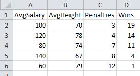
In my dummy sports data below, you can see that the number of penalties is correlated most strongly to wins.

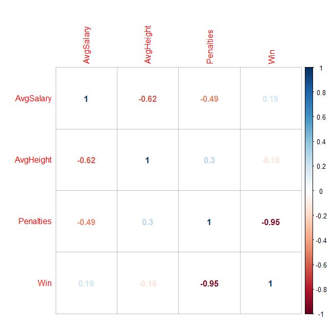
But, if you had hundreds of variables, how could you generate the cross product of every correlation possible, in order to find the variables with the highest correlation? One answer: Use the Stats program called “R” to create a correlation matrix! You can generate all sorts of visual outputs, as well. Penalties sticks out like a sore thumb now:


Disclaimer: Without stating a hypothesis up front, these finding is nothing more than “data snooping bias” (ie: curve fitting) The discovered association might simply be natural random variation, which would need to be verified with an out of sample test to have any validity at all.
To do this for yourself, here are the steps:
Enter the following commands in R:
(The lines with # are just comments, do not type them. Just paste the bold commands!
# Import data
> data1 <- read.csv(file.choose(), header=TRUE)
# Attach data to workspace
> attach(data1)
# Compute individual correlations
> cor(Penalties, Win)
# Scatterplot matrix all variables against each other
> pairs(data1)
# Generate a CORRELATION MATRIX !!
> cor(data1)
Here is how to generate the visual output:
> library()
…Scroll back up to the very first line of the popup window. Packages are probably in something like library ‘C:/Program Files/R/R-3.3.0/library’
Download and install “corrplot” Windows binaries package into the library path above.
Note: When you extract, you will see the folder heirarchy: corrplot_0.77/corrplot/….
Only copy the 2nd level folder “corrplot” into the library/ folder. (ie: Ignore the .077 top folder)
# import corrplot library
> library(“corrplot”)
# generate correlations matrix into M
# You now redirect the cor() function output we used above into a matrix called “M”
> M <- cor(data1)
# Plot the matrix using various methods
# Method can equal any of the following: circle, ellipse, number, color, pie
> corrplot(M, method = “circle”)
> corrplot(M, method = “ellipse”)
> corrplot(M, method = “number”)
> corrplot(M, method = “color”)
> corrplot(M, method = “pie”)
 Here is a question someone recently asked me: What’s the probability that two students taking a multiple choice test with 29 questions will get exactly the same wrong answers on 10 of the questions?