RE: Birthday Dinner
Yes, life does go by fast. Strangely, the older you get, the faster it goes. I do not know why this is.
Ever get an email like this? Well, as your age varies, the percentage of your life that a single calendar year represents also varies. As you get older, a year is a smaller percentage of your overall life. In other words, 1 year represents 50% of a 2 year old’s life. However, it is only 2% of a 50 year old’s life. So, perhaps that is why each year seems to go by faster.
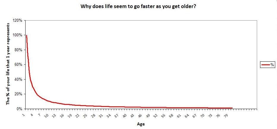
Want to see the percentage for every age from 0 to 80? Let’s make a formula and graph it. The percentage of your life that a single year represents is just a function of your age: \(f(age) = \frac{1}{age}\) If you graph this on a spreadsheet, you’ll get the following:
How would you interpret this graph? You’ll notice that once you pass the inflection point, the percentage seems to flatten out. So, at what point can a person legitimately start saying “Wow, this year really flew by?” Based on the graph, teenagers might feel this almost as much as middle aged people.
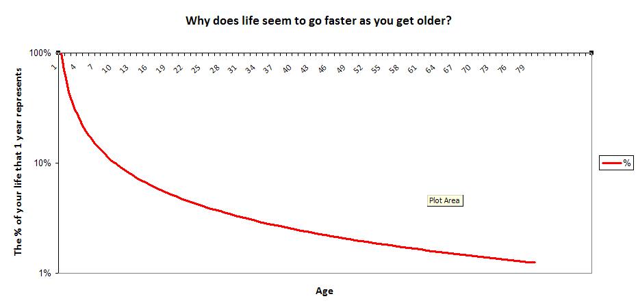
Lastly, do you notice how scaling of the y-axis makes the difference between age 15 and 50 look trivial? In order to properly display percentage changes, I will scale the y-axis logarithmically. Here is the result:
With this scaling, you can see a year in the life of a teenager (~6%) is quite different than a year in the life of someone in their 50s (~2%)

